The post about How to think like an Architect? was like the start of this topic about how to sketch like an architect < that's really good idea for calling this topic like that!
So today I want to share that post with you! I hope it will inspire you!
Link to the full post: http://www.lifeofanarchitect.com/architectural-sketching-or-how-to-sketch-like-bob-borson/
So I am going to look at 5 tips and techniques that should improve your sketching.
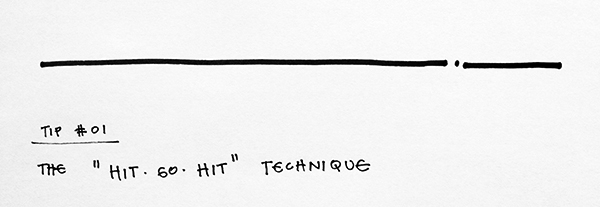
TIP #01: “The Hit-Go-Hit”
The ‘Hit-Go-Hit’ tip is a way for you to pick up and set your pen back down on the page as you’re drawing in a purposeful manner. Why would you need to do something like that you ask? Well, tip #02 will elaborate a bit more (come to think of it, Tip #02 should really be the first tip in terms of importance but I’m not going to remake the graphic) but whenever you are drawing a straight line, you’ll frequently find that you need to reposition your arm, or the paper, to continue drawing. Make that reset look intentional and add some graphic flair with this technique.
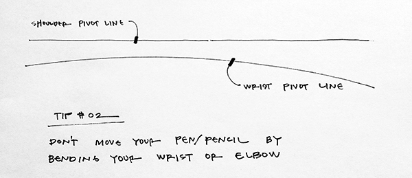
TIP #02: “Don’t Move your Pen/Pencil by Bending Your Wrist or Elbow”
I should also point out that you shouldn’t “push” your pen across the page, you should always “pull” it. Lock your wrist and elbow into a comfortable angle and only move your entire arm when sketching. As you get more skilled, this tip can be relaxed and you can first bend your elbow and ultimately your wrist. In the beginning, by limiting your movement to the entire arm, you’ll end up with straighter lines. And since you can only move your arm so far, that’s when the hit-go-hit technique comes in.
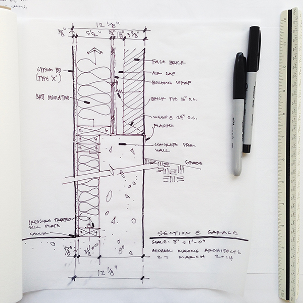
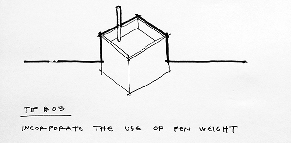
TIP #03: “Incorporate the Use of Pen Weight”
This technique is a biggie … you have to use line weight to help convey depth to your sketch. More gifted sketchers and take care of depth using hatches and shading techniques so eventually that’s something you can take on. In the meantime, use two pens and get some profile lines into your sketches.
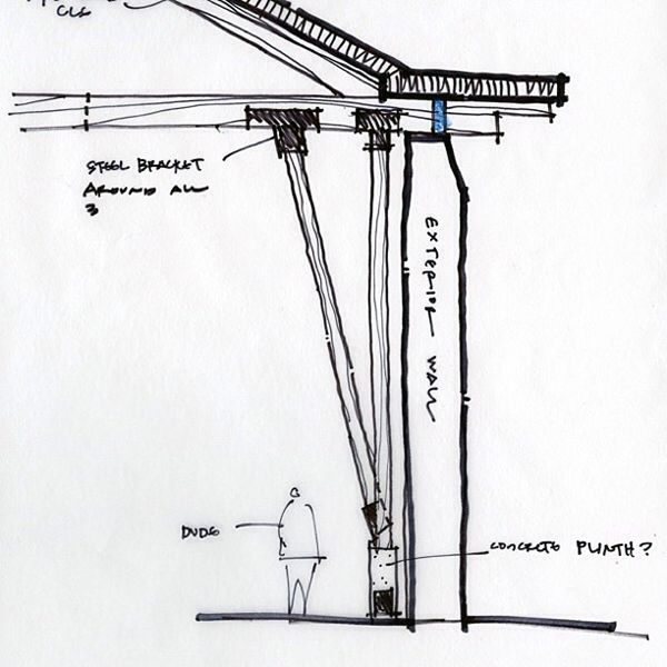
Another benefit to using a heavy pen is that it can help show you what you should be looking at – what the point of the sketch might be. Multiple pen weights help the viewer understand the order of things within the drawing, and through proper technique, they can also show to the viewer what’s not important in the sketch.
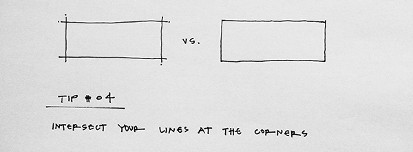
TIP #04: “Intersect Your Lines at the Corners”
This is pure style and allows the inexact nature of a sketch to come across as what it is – a delineated representation of a thought or concept.The inexact nature of the sketch – when attempted to be exact – looks sloppy and, well … inexact. By allowing your lines to cross at the corners, you can still convey the thought (or shape) you are going after, without having to focus on making the shape perfect. There is a “in-the-moment” that sketches imply and if you look at the two rectangles illustrated above, I think the one on the left looks far better despite the fact that it is far less precise or exact than the rectangle on the right.
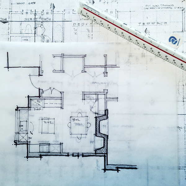
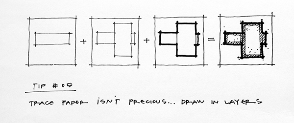
TIP #05: “Trace Paper isn’t Precious … Draw in Layers”
Design is an additive process so why shouldn’t your sketch be as well? Since most of my sketches happen on trace paper and not in a sketch book, I am able to lay sketch upon sketch on top of one another to build up and refine my sketches. I may start with a clean piece of trace paper for every sketch, but it’s only that first sketch that doesn’t have the benefit of something prior to work from.

That's it. Here are the 5 ways or techniques (sounds better), that should make your sketches look better and you will put more discipline in your sketches.
I recommend you to read the full post if you want to be inspired!
No comments:
Post a Comment